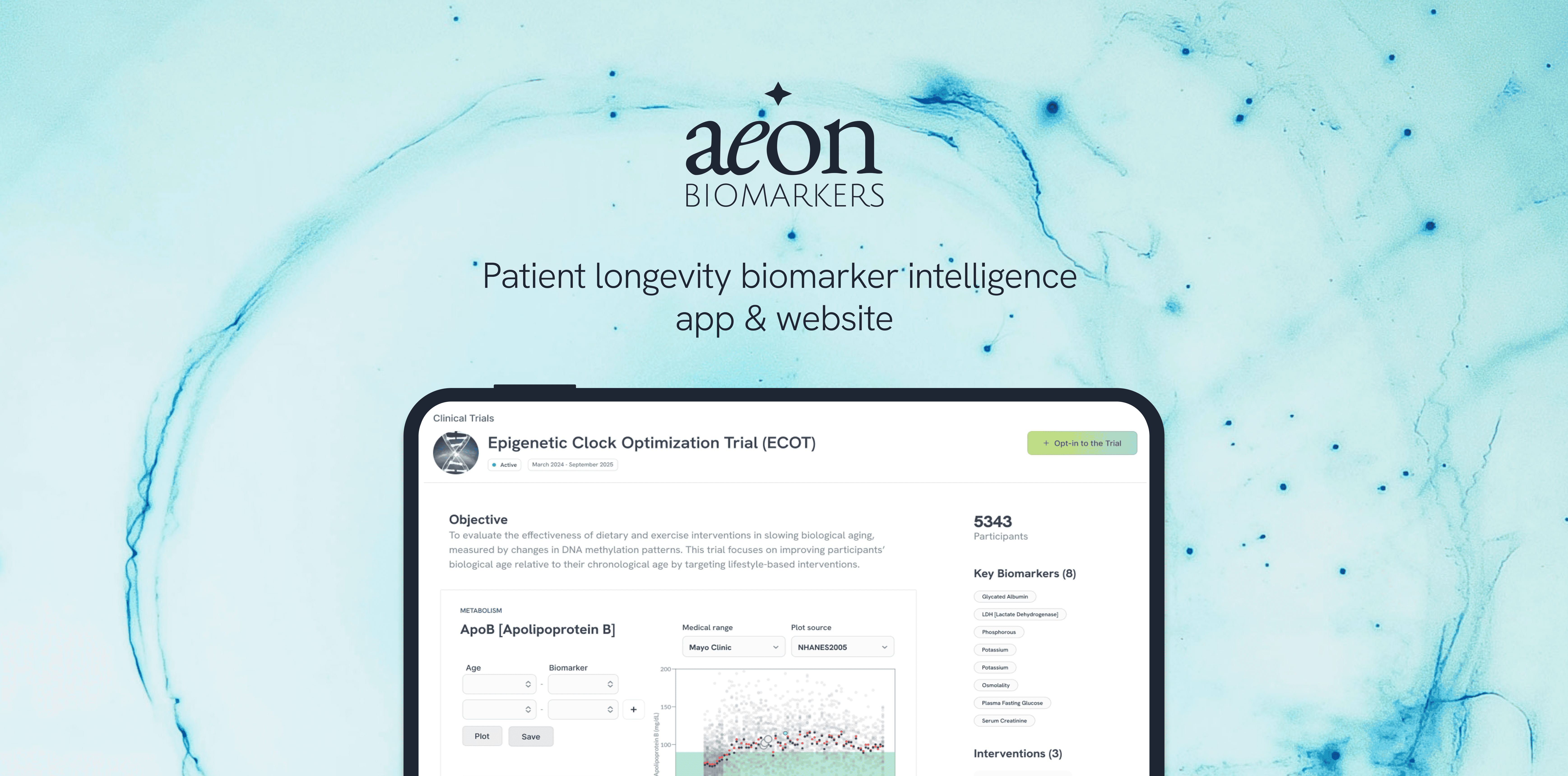
Biomarker Map · Healthtech, B2B & B2C · 2025

Aeon: health and aging profiles, maps & dashboards
- ROLE
- Lead Product Designer, founding team
- TEAM
- Scientific founder · medical advisors, full stack engineer · me
- MEDIUM
- Web app, website, visual design, logo
- LINK
- aeonbiomarkers.com
- STATUS
- Live behind a clinician login
TOOLS
- Figma
At a glance
- Problem
- Clinicians couldn’t see how a patient’s biomarkers influence each other or drift with biological age.
- What I did
- As founding designer, turned the spreadsheet into an interactive biomarker map a clinician can read in seconds.
- Outcome
- Used in the pre-seed raise, moved the roadmap from analysis to intervention, and brought in the first clinics.
- 3 clinics
- The first 3 clinics joined as early adopters
- Pre-seed
- Used in the pre-seed raise, to showcase capability and need
- 0 → 1
- Onboarded initial users, with no prior product
Challenge & context
I designed AeonBio's interactive biomarker map, making biological aging legible to clinicians, used in the company's pre-seed raise.
Problem
Clinicians couldn't see how a patient's biomarkers influence each other or drift with biological age. The data existed, nothing made the relationships readable, comparable over time, or quick to scan.
The bet: turn the spreadsheet into a map, and a clinician grasps a patient's aging profile in seconds, not hours.
Who and why
Designed for three users
- Clinicians: longevity & preventative
- Researchers: population trends
- Biohackers: self-tracking
The hard part. No user data and no reference product existed. So I designed for cognitive load first, a clinician should read a patient before reading a number.
What we prioritised
Four principles, every decision below answers to them:
- 01Readable at a glance
- 02Relationships visible
- 03Change over time
- 04AI predicts, human decides
“No one had designed a way to see a patient’s whole aging profile at once.”
How I worked
- Designing in an empty field
- No reference product existed, so I explored how node-relationship maps work in other domains before committing to one.
- An AI-native product
- Trajectory prediction, record parsing and trial analysis are AI features I had to design trust into: confidence, correction, human override.
- Judgement led
- Every clinical-facing AI output is a suggestion, never an answer. A design principle, not a technical limit.
What I did
01Every element, on one screen Readable at a glance
Proved the map, filters, search and age timeline could all fit on one screen.
02Colour carries age, not just the value Readable at a glance
Node colour shows age state, so a clinician reads a patient’s pattern before opening a single value.
Iterated: age-coded nodes, grouped categories
03Cutting the clutter from every node Readable at a glance
Moved raw values to hover and lightened the map, so it reads as a pattern rather than noise.
04AI predicts, the clinician decides AI predicts, human decides
The side panel adds AI-suggested interventions and a population comparison; the clinician keeps the call.
Concept ideas
A journey through wireframe sketches to visualise biomarker readbility and categorisation.
Relationship-map studies
01Every element, on one screen Readable at a glance
Proved the map, filters, search and age timeline could all fit on one screen.
- Problem
- Could the map, category filters, a global search and an age timeline all fit on one screen?
- Result
- The first full-screen attempt held all of it, without a second screen.
- Trade-off
- It was also the version everything after this had to simplify.
Before it could be simple, it had to exist as one whole screen.
02Colour carries age, not just the value Readable at a glance
Node colour shows age state, so a clinician reads a patient’s pattern before opening a single value.
- Problem
- With a named patient in the frame, reading their pattern still meant opening values one by one.
- Shipped
- Each node coloured by age state (youth, good, at risk, aged), with biomarkers grouped into labelled clusters like Metabolism, Fatty Acids and Antioxidants.
- Result
- A clinician reads a patient’s overall pattern in the colour alone, before opening a single value.
A clinician shouldn't have to read the map to understand the patient.
Iterated: age-coded nodes, grouped categories
03Cutting the clutter from every node Readable at a glance
Moved raw values to hover and lightened the map, so it reads as a pattern rather than noise.
- Problem
- With every value printed on every node, the map read as noise rather than a pattern.
- Tried
- Every value visible at once
- Shipped
- Raw values on hover, lighter node colours, and redrawn connection lines.
- Why
- Relationships stay legible while the map stays calm. I marked up the screen directly to show what had to go, then rebuilt it.
Density isn't depth. The map earns trust by staying quiet.
04AI predicts, the clinician decides AI predicts, human decides
The side panel adds AI-suggested interventions and a population comparison; the clinician keeps the call.
- Problem
- The first side panel (current values, linked biomarkers, an AI-predicted trajectory) was enough to open the conversation, but not enough to act on.
- Shipped
- AI-suggested interventions and a population comparison, in the same panel.
- Why
- A clinician moves from “what is this” to “what would I do” without leaving the screen. AI proposes; the clinician keeps the call.
In clinical tools, AI is a second opinion, never the decision.
What shipped
Demo of the biomarker map, and the screens around it.
Website
Simple, easy to scroll, designed to understand the product value at a scan.
Impact & evidence
Pre-seed
Used in the pre-seed raise, to showcase capability and need
Roadmap
Influenced the product roadmap: pivoted from analysis to intervention
3 clinics
The first 3 clinics joined as early adopters
0 → 1
Onboarded initial users, with no prior product
Vision
Made the vision legible to non-technical stakeholders
MVP
Set the foundation for the MVP
What I learned
- Designing in ambiguity, with no user data and no template, is its own skill.
- Working with a scientific founder taught me to turn complex medical goals into UX patterns.
Would do differently
- Get the map in front of real clinicians sooner: earlier hands-on sessions would have caught interaction friction before the build.